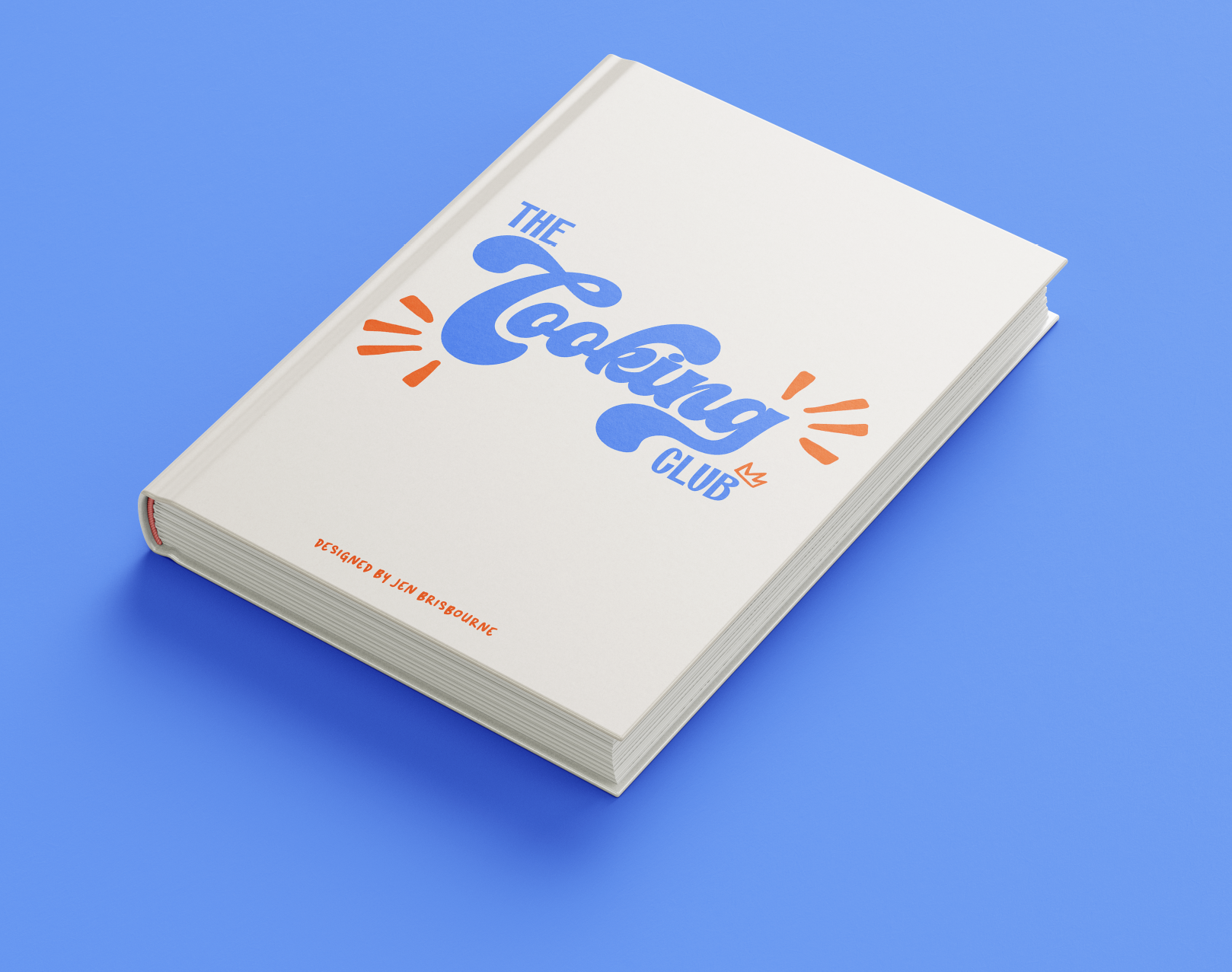
The cooking club
Project: The Cooking Club | Passion project redesign
Deliverables: Final PDF(interactive), ePub
Goal: Redesign the “Let’s Cook” A Cookbook from my 2023 portfolio. Design a completed cookbook with multiple categories, and interactive features to be functional as an e-book.
Problem: Original cookbook was boring, lack of layout design, including the typography, wasn’t a proper e-book, and was too short.
Solution: Created a functional e-book with fluidity by using typography, layout design, interactive features, and a style guide.

Let me take you back to 2023 when I was a fresh graphic design graduate, and I decided to design a cookbook – news flash, it was terrible. The colour scheme, the layout, the typography choices...were all…questionable! But I was learning, and with time I have learned more about the software, design elements, grids and more!
The Goal
In 2024, I wanted to take “Let’s Cook!” and turn it upside down, and create a completely new one with a similar premise, but make it better. I wanted to create a complete cookbook that is functional, with over 100 different recipes, a complete layout design with interactive features that would make this book into an e-book that I could use on my phone, and even send to my friends and family!
The Cooking Club
Notes and Brainstorming
The first steps I took was looking over my original cookbook, looking over what I liked, disliked, and what I needed to improve on.
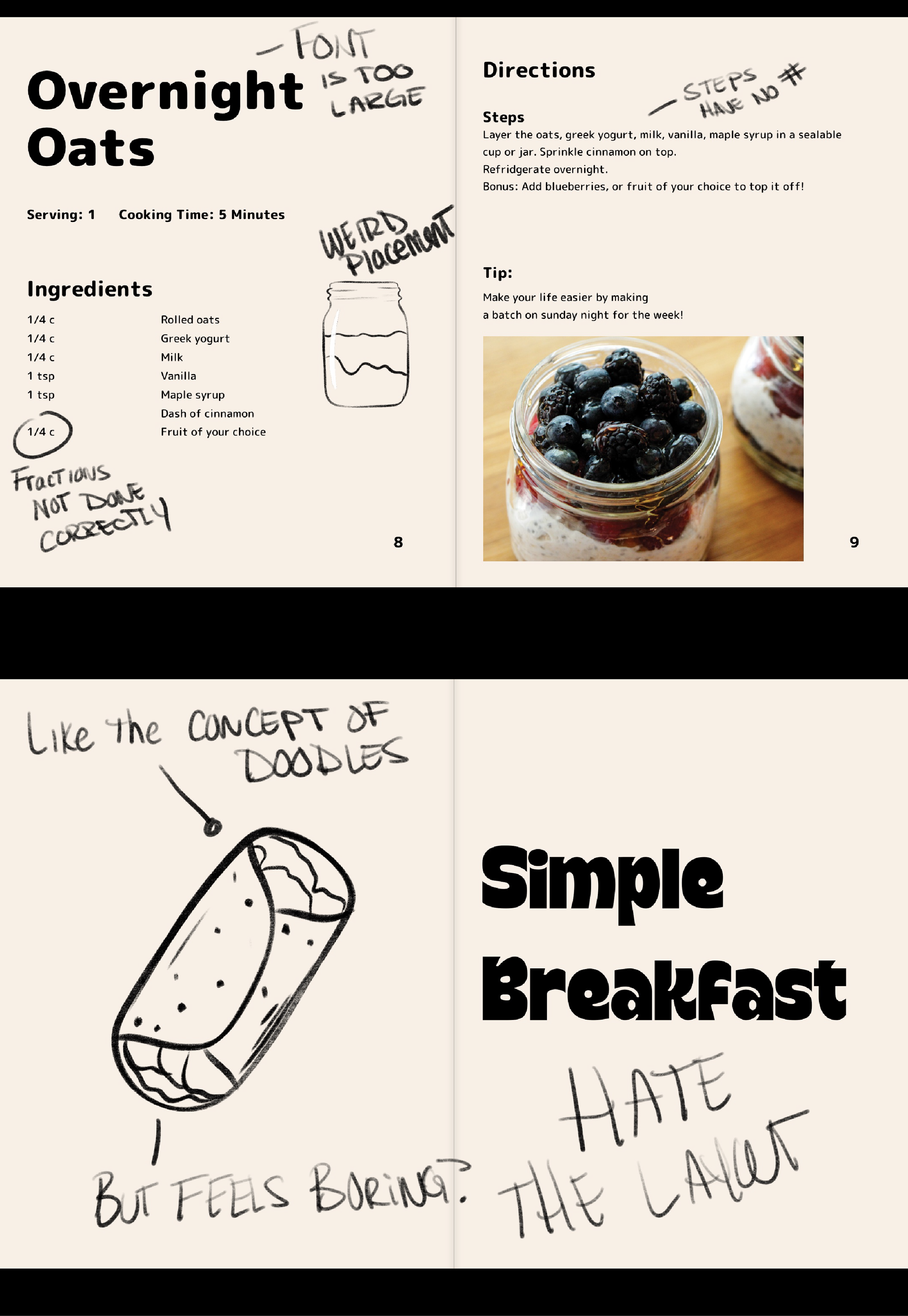
I made notes on many different things. For starters, I hated the colour scheme. I used this egg shell white colour, and I overall don’t vibe with this. It feels…off the lack of colour didn’t vibe well with the overall style.
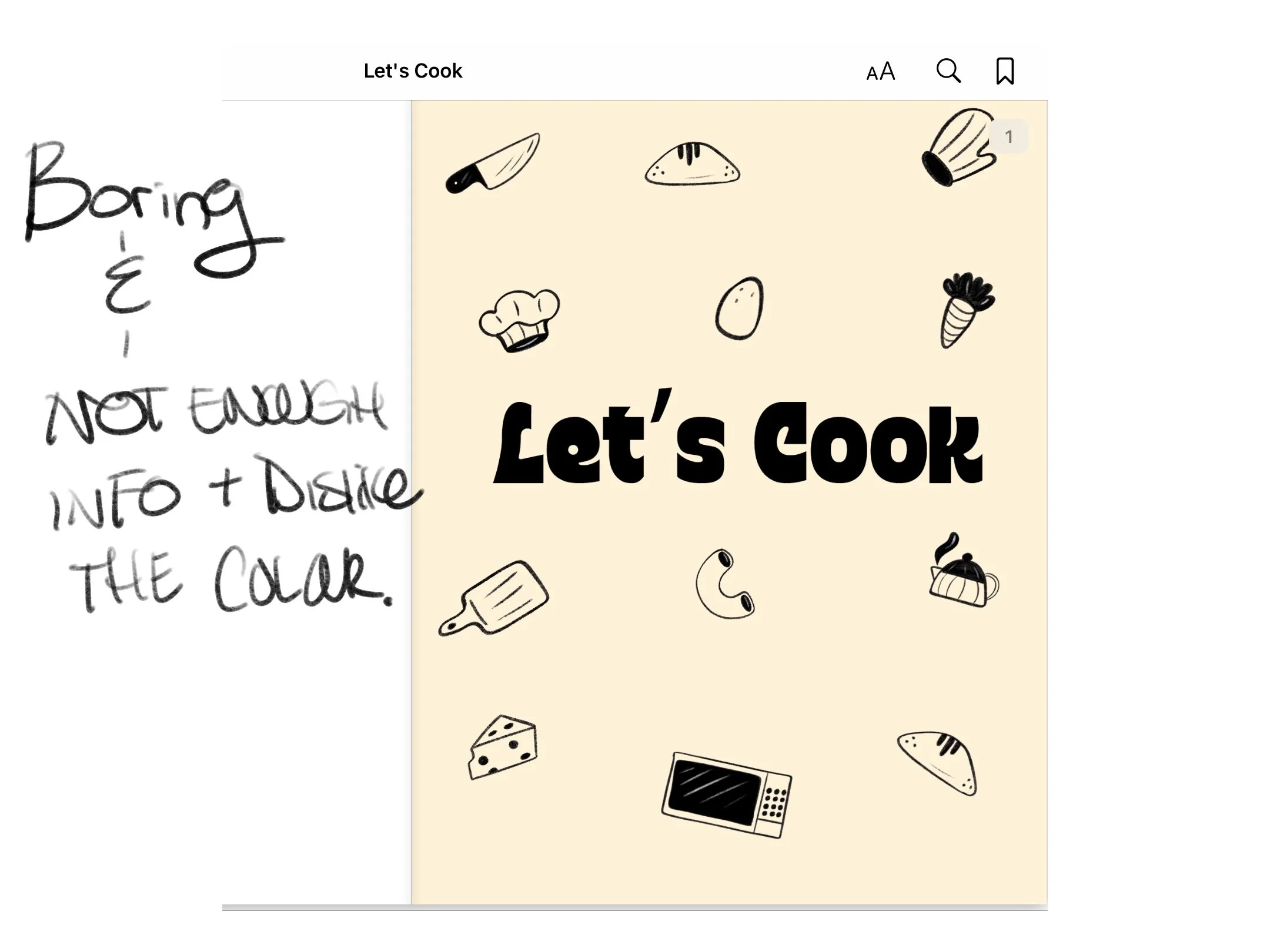
I didn’t care for the typography and font choices. The font was too large, and it occupied too much space! If this would’ve been printed out, it would’ve been WAAAY too large of a font.
The layout was very bland, and it seemed to be very minimal with a lack of space. and I felt that there wasn’t enough content at all for this. I liked the idea of having images, a minimal design aspect, with the potential use of doodles. I kept these ideas and wrote them down for myself to keep in my mind.
Inspiration, Research, and Mood Boards
Gathering inspiration and research is honestly one of my favourite parts of design! I get to see what other designers are doing, create fun ideas, and get inspired.
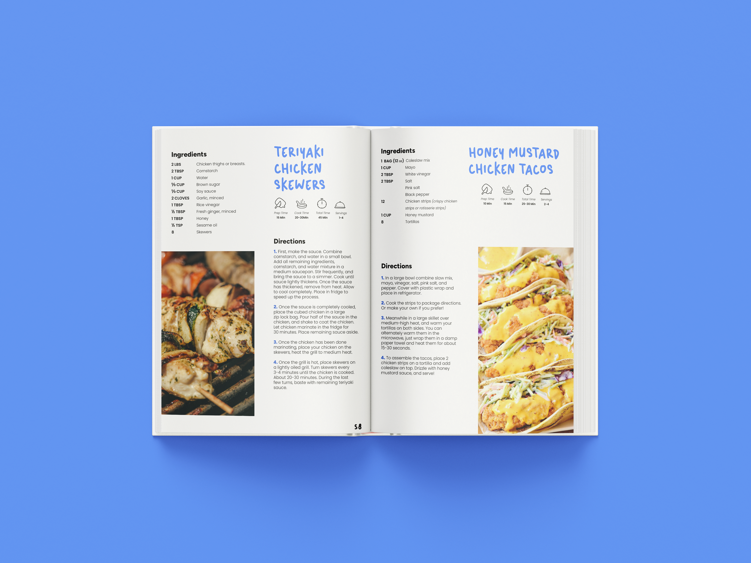
I researched what cookbooks typically have for content, how the structure works, what needs to be included, and even went looking for what people love about cookbooks. I found that people enjoy having images to see what the final recipe should look like, others enjoy having tips, and some love seeing the cook time. I took these into account when I wanted to design.
Another aspect I saw was many loved the idea of a square layout, something small. No one wants a large cookbook when they’re cooking, but since I was designing this as an e-book, I went with just the standard portrait, but I still found this information to be great to remember!
I found my way onto websites such as Amazon, Indigo, and other platforms where people sell cookbooks to see how they look to get an idea of how they should be presented. BUT then I had a better idea! I went into my kitchen and found some cookbooks that are published by real chefs and designers and went through to see how these cookbooks were also designed to get a better idea.
I went on platforms such as Behance and Pinterest to gather ideas. I even made my own board on Pinterest for this cookbook and saved whatever fit my overall design idea. Once my Pinterest board was complete, I designed a mood board.
My mood board was consistent with ideas surrounding: typography, colour, layout, and illustrations.
My design concept was a minimalist cookbook with blue colours and a splash of retro typography. I took the idea of the doodle aspect I had from “Let’s Cook” (previous project) and incorporated them, alongside handwritten typography for when I have my tips. I wanted this cookbook to feel like it was handmade in a way.

Style guide
The style guide was designed after my creative process was complete and I was satisfied. That’s when I went searching for commercial free fonts, and the colour palette. This process actually changed quite a bit during my design process. I changed the blue, made it brighter, and even incorporated some orange as a complementary colour.
Once I was satisfied with the style guide, I went into adding the colour palette into Adobe InDesign, alongside with the paragraph, character and object styles, which I will explain more in the design section!
Content and Recipes
In this process, I gathered all the recipes I loved that were on my phone, in my notes app, in family cookbooks and recipe cards, and wrote them all on my computer. I organized them by category so it wasn’t a mess when it came time to insert them into the design process. I made sure all the recipes were correct, and that I wasn’t missing any information.
This part I found redundant! It was definitely the most tedious aspect of the project and it actually took me quite some time to get all the recipes I wanted. I didn’t want this to be a 30 recipe book, I wanted this cookbook to be FULL.
During this process I also gathered inspiration and research so I wasn’t completely bored out of my mind! Which I will explain further.
Layout Design and Grids
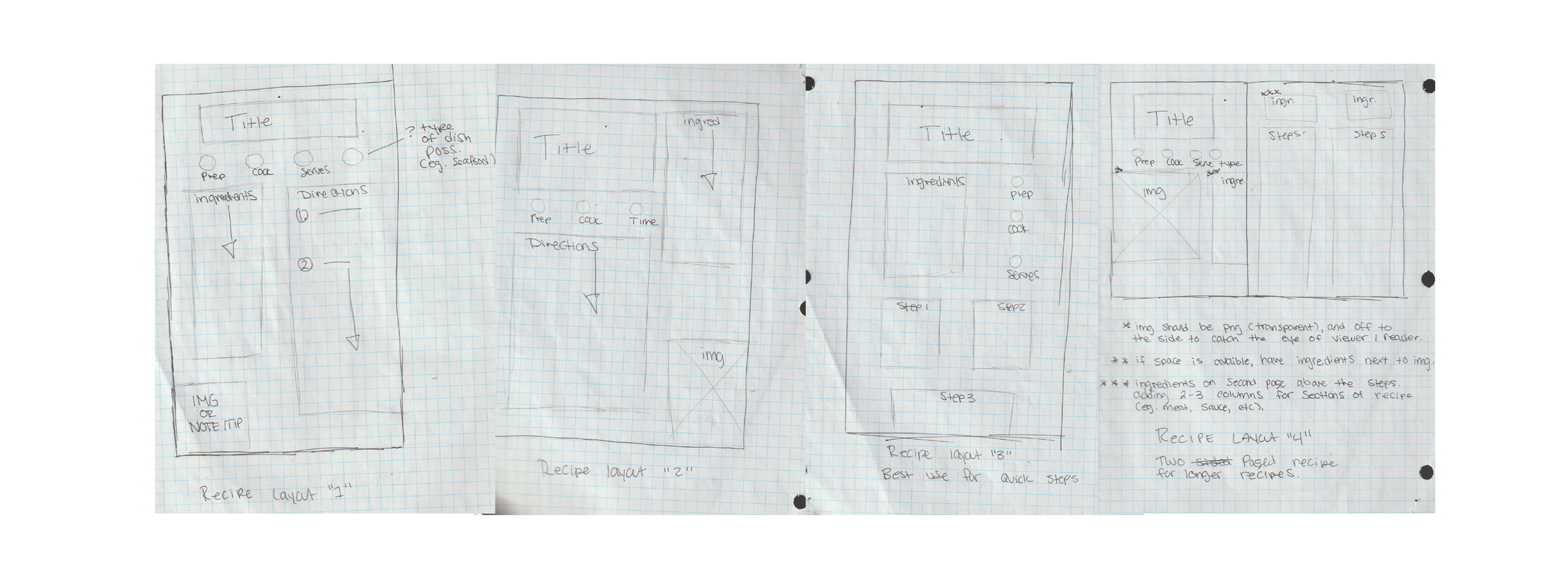
I’ve used layouts and grids before in other projects, but this was more new to me! I wanted to really learn more about grids, creating them in InDesign, and how to create a fluid structure.
With my inspiration, I went and created some thumbnail sketches of what I wanted the layout design to look like. This gave me a great idea of how I wanted each recipe page to look. I came up with a few thumbnails for this, just to get an overview of what I wanted. I did not want anything too crazy. I wanted the layout to be simple so when the user is cooking, they don’t feel overwhelmed. Once the layout was done, I took the grids and designed them in InDesign.
Design Process
The magic! I designed this cookbook using Adobe InDesign. The cookbook was 8.5” x 11” portrait size. My overall use for this cookbook was to have it designed for my iPhone, so I did not want to use a landscape style. I started with 100 pages, but had to add more pages, consisting of 124 pages. The document was in RGB mode since this was going to be solely digital.
I started with getting my layers ready. This included: background, text, img/graphics and interactive. I made sure to lock the layers I wasn’t using so I didn’t accidentally design on the wrong layer. From here I added the paragraph, character and object styles, making sure everything was labeled correctly so I wasn’t lost, and I also added in my colour palette.
Once grids were complete, I began to add in the content, and used the paragraph and character styles to fix the format and design. This process changed a bit, because I didn’t originally like my font choice. Since I liked the idea of the handwriting, I wanted the titles to look as if they were handwritten. For the body copy, and headers, I wanted to use a very easy to read typeface–‘Poppins’.
I also designed iconography for the cooking time, serving time, etc. I had to place things around, and change the font a bit for the fractions. I even tested these recipes while baking to make sure it was easy to read and follow along (and to make sure there were no mistakes)
I added grey shapes for where my images would be but didn’t place the images until the very end, alongside the buttons and interactive features.
At the very end of my design process, I made sure to read through every recipe to make sure they were spelled correctly (and also used spellcheck). I also checked to make sure I used the proper character and paragraph styles.
When this was completed, I went onto the interactive features and gathered commercial free images.

Interactive Elements and Getting Ready For EPub
I have used interactive features before, but not to this level! I have used the ability to have interactive PDFs so I knew a bit about how to add buttons and hyperlinks but adding the e-book features was new to me.
I made sure to add bookmarks for each chapter, and also added buttons and the ability to click through different sections (especially at the Table of Contents section).
Although I’m not publishing the cookbook for the public and/or selling it, I wanted to complete this functionally.
At the end of this, I tested all the buttons, bookmarks and interactive features to make sure everything worked. I saved two types of documents: Interactive PDF and ePub.
I added it into my library on Apple Books and tested it on my MacBook, my iPhone, and iPad to make sure it worked and looked great and that I was happy with it!

Overall Thoughts
This project took me roughly 5 weeks to complete. This process made me appreciate cookbooks more! The amount of work that goes into cookbooks, layout design, and how redundant it can be when you’re designing the same thing over and over! There were times when I was bored out of my mind from doing the same thing over and over, but at the end of the project, I was very happy!
I learned more about typography, layout design, using and designing grids and also interactive design features!
At the end of the project, I completed my goal to design a functional e-cookbook!
I look forward to doing more case studies and documenting more of my projects! Thank you to everyone who took their time to read this case study.

Additional Information
Programs used: Adobe InDesign, Adobe Illustrator
Document size: 8.5” x 11” Portrait mode. RGB. 124 Pages
Fonts used: Poppins, Micu, Nord
Final Deliverables: PDF(interactive), EPub