Dingos Cafe - Case Study
Dingo’s Cafe is an exciting new cafe and art studio soon to open in Vancouver. They are passionate about great coffee, creative self-expression, and celebrating all forms of art. The space is designed to inspire and bring people together through creativity and community.
Project: Visual Brand Identity
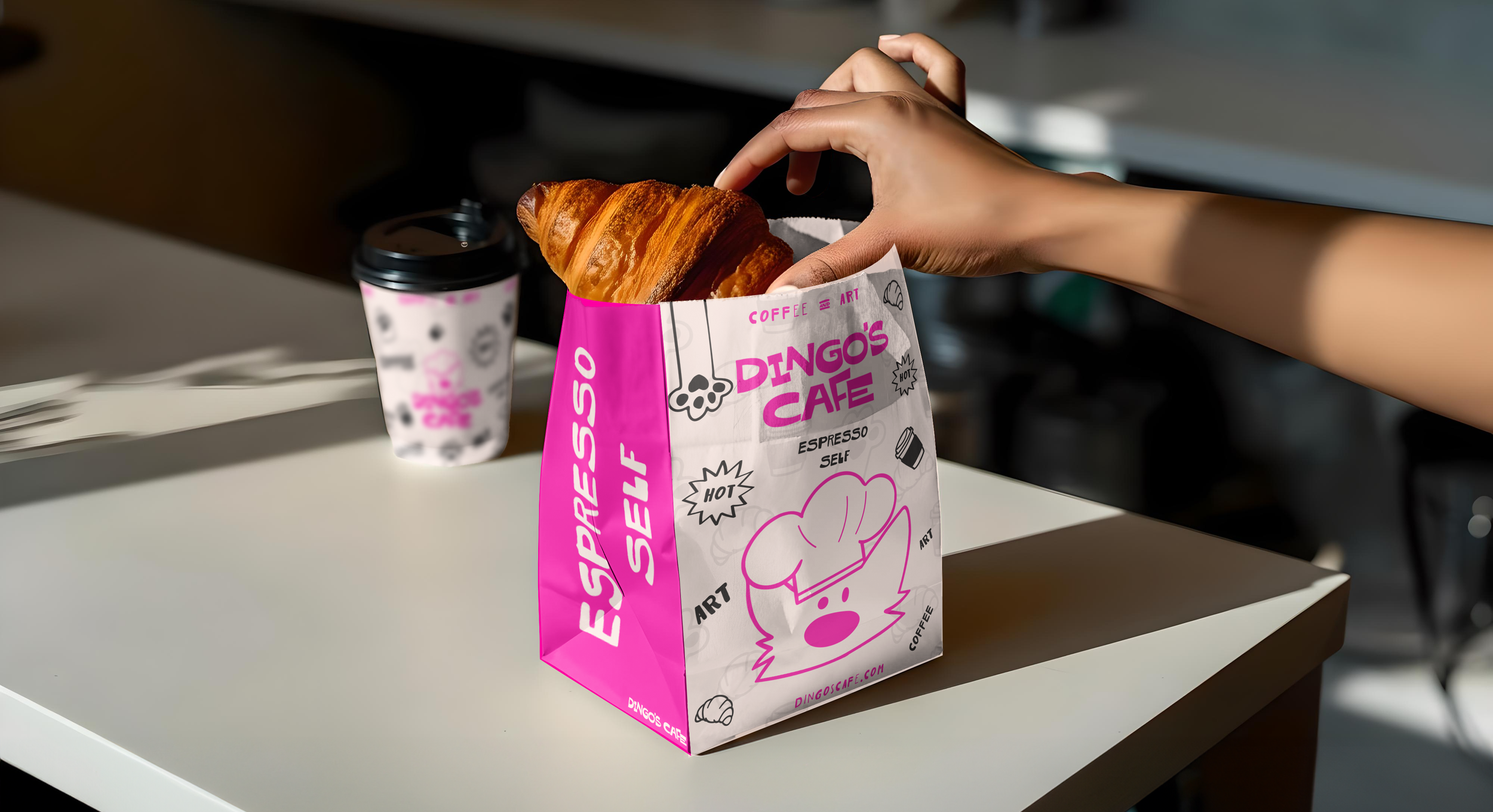
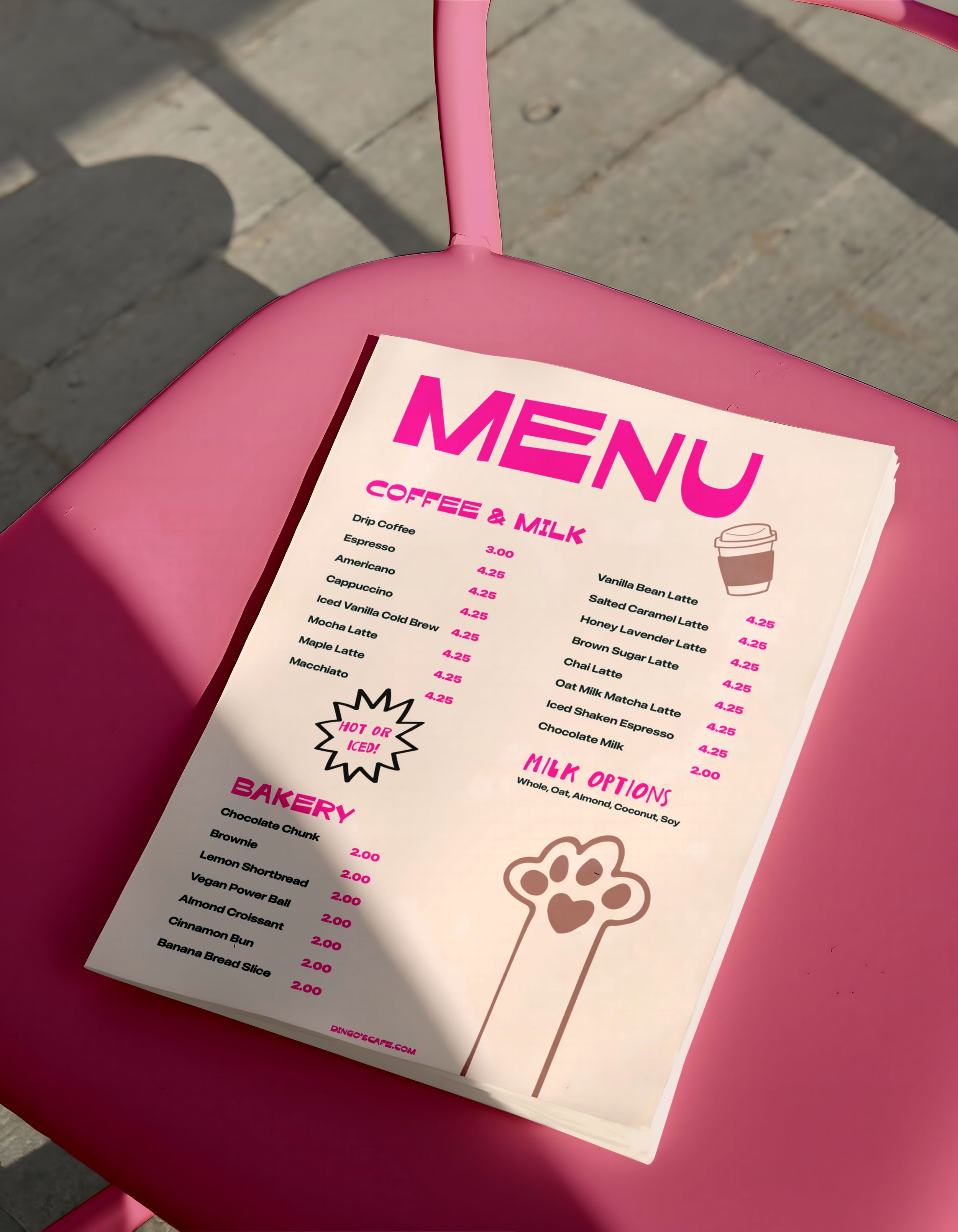
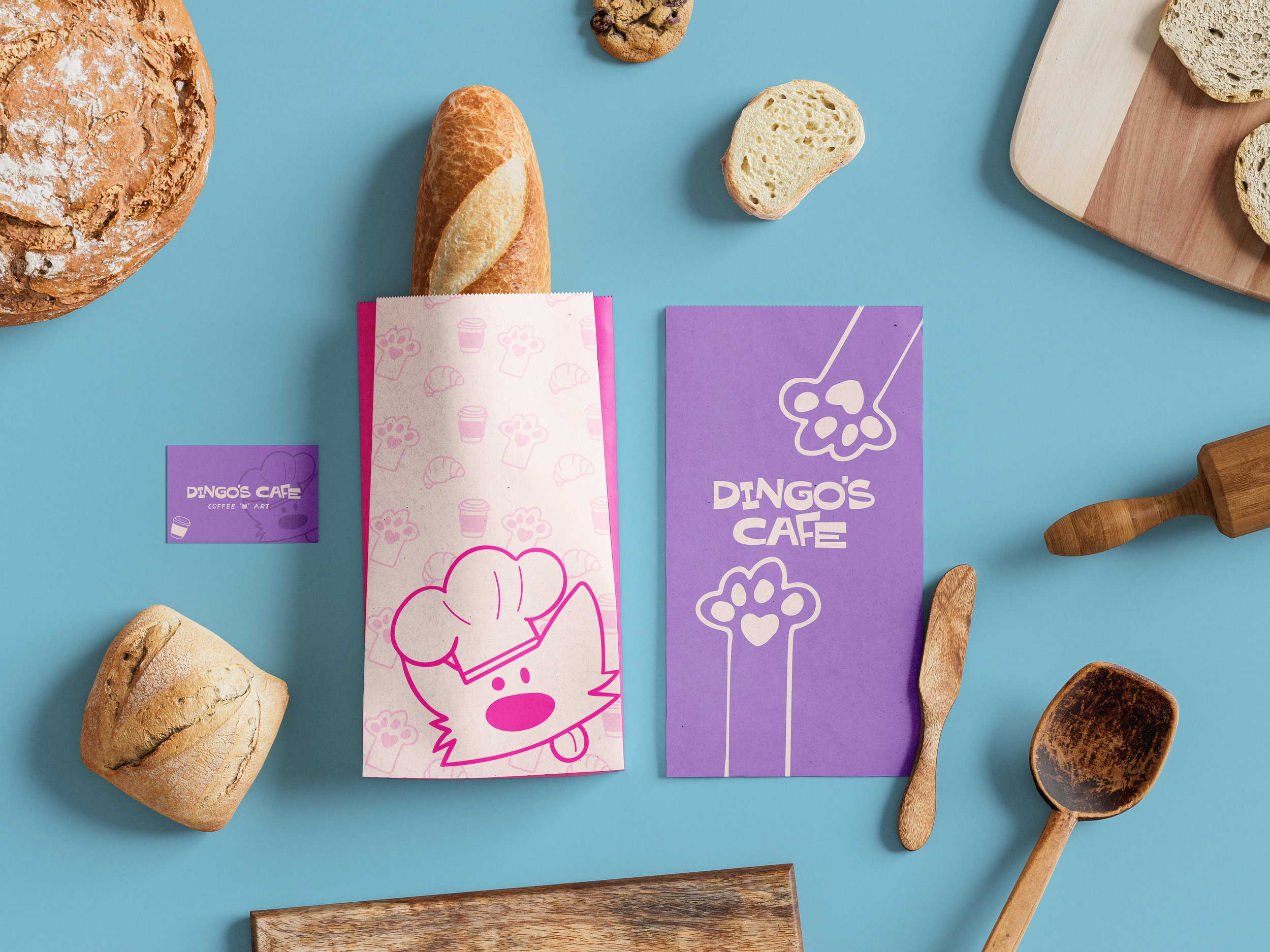
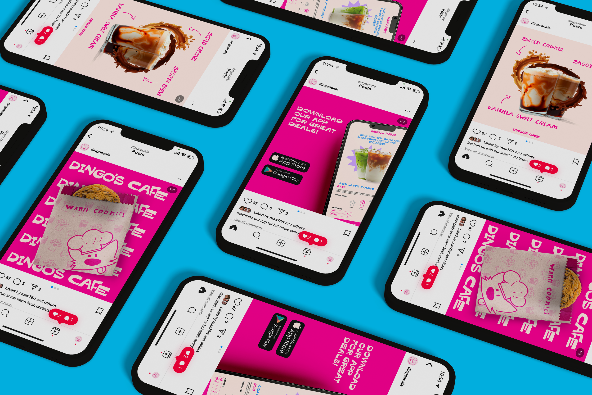
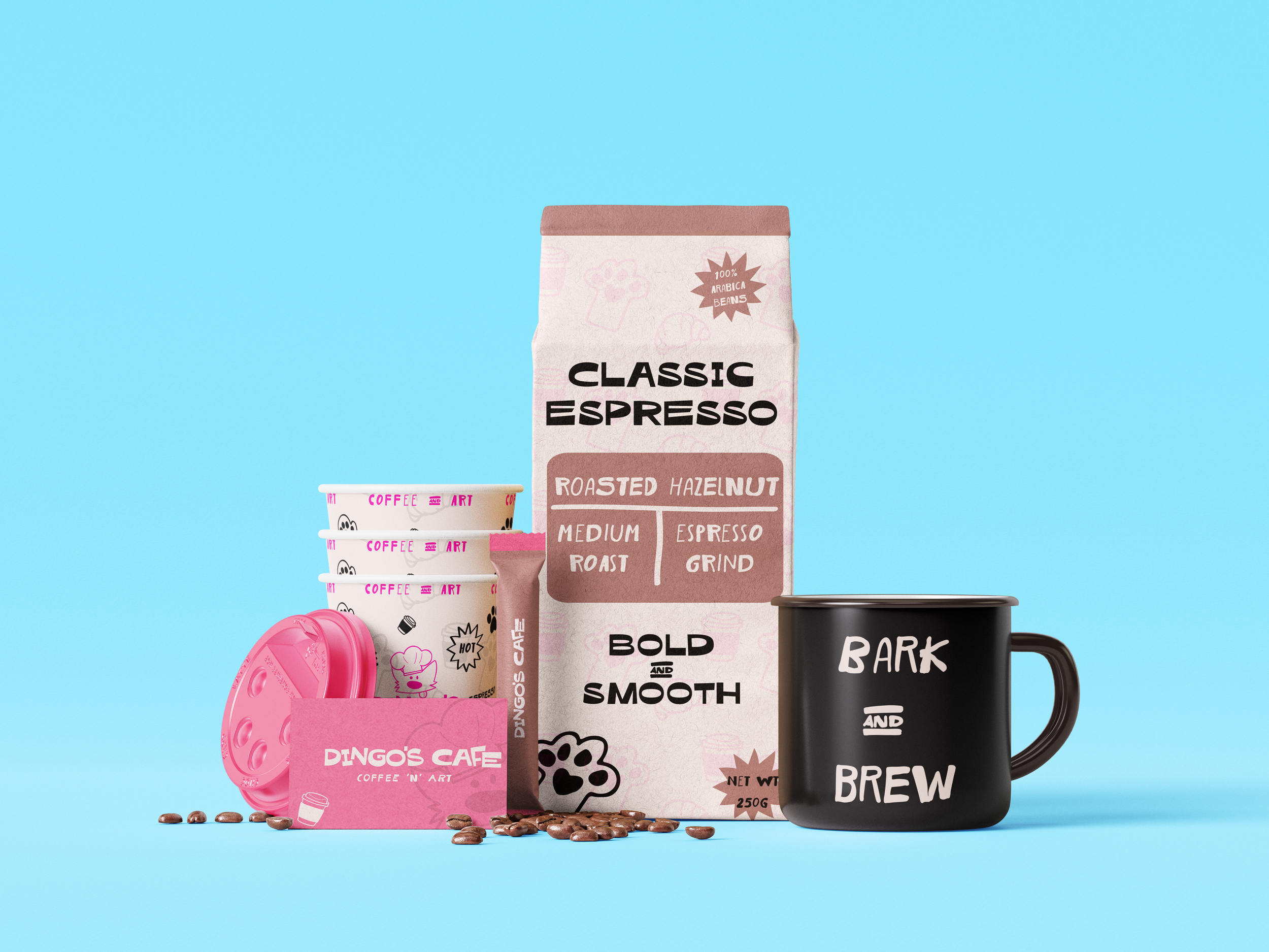
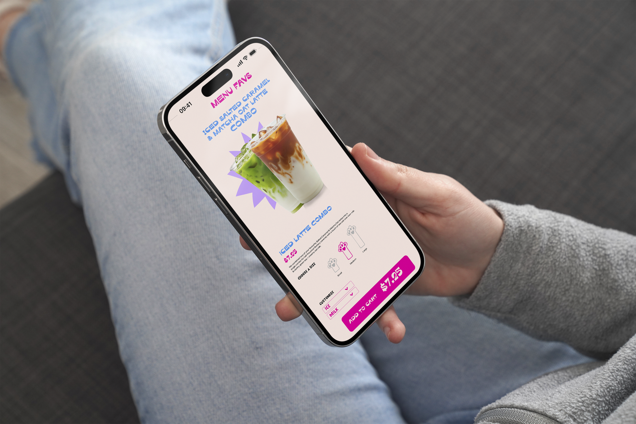
Deliverables: Visual Brand Identity (Logo suite, colours, typography, pattern), Social Media Grid, Instagram Highlight Icons, packaging design, print design, and merch
Goal: Redesign “Dingo’s Cafe”. an old project from when I was in design school.
Keywords: Playful, expression, and fun.
Dingo’s Cafe was a branding project I did while I was in design school in 2022. I was given a letter “D” and had to choose an animal to create a brand with that letter. I chose a dingo. Although it was my first branding project, looking back it was pretty boring, lacked a lot of design elements. I was new in design, and I didn’t have a lot of branding experience nor did I understand Adobe Illustrator as much, so I challenged myself to redesign this project by keeping the main elements: the brand, coffee, a dingo and the colours.
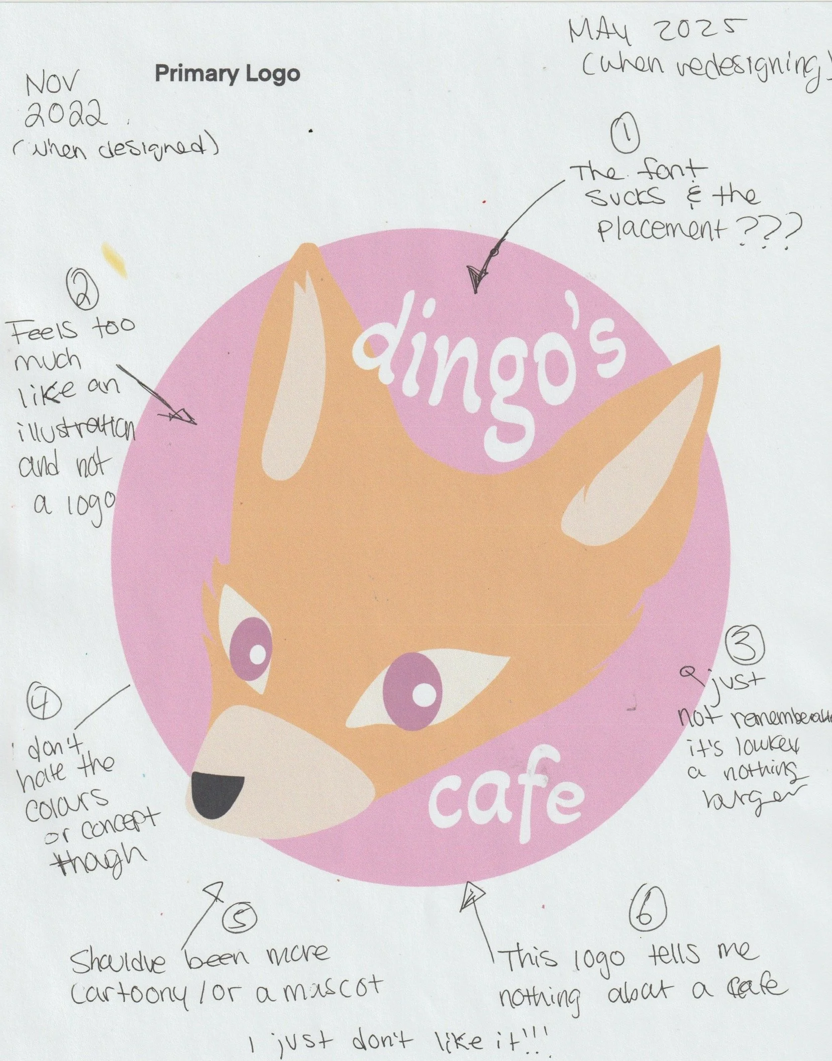
The Original Design - Oh it’s bad.
I first had to look at my old design. It wasn’t awful but it wasn’t exactly great either. I made notes on what I liked, disliked, and what I felt should be included, expanded upon and trashed.
Overall, what I didn’t like the most was it felt so incomplete, it felt more as a concept rather than a finished design. I did like the idea of using the mascot of a dingo, and I really did enjoy the colours but I did go in and change the colour palette, but still kept this playful and fun colour concept.
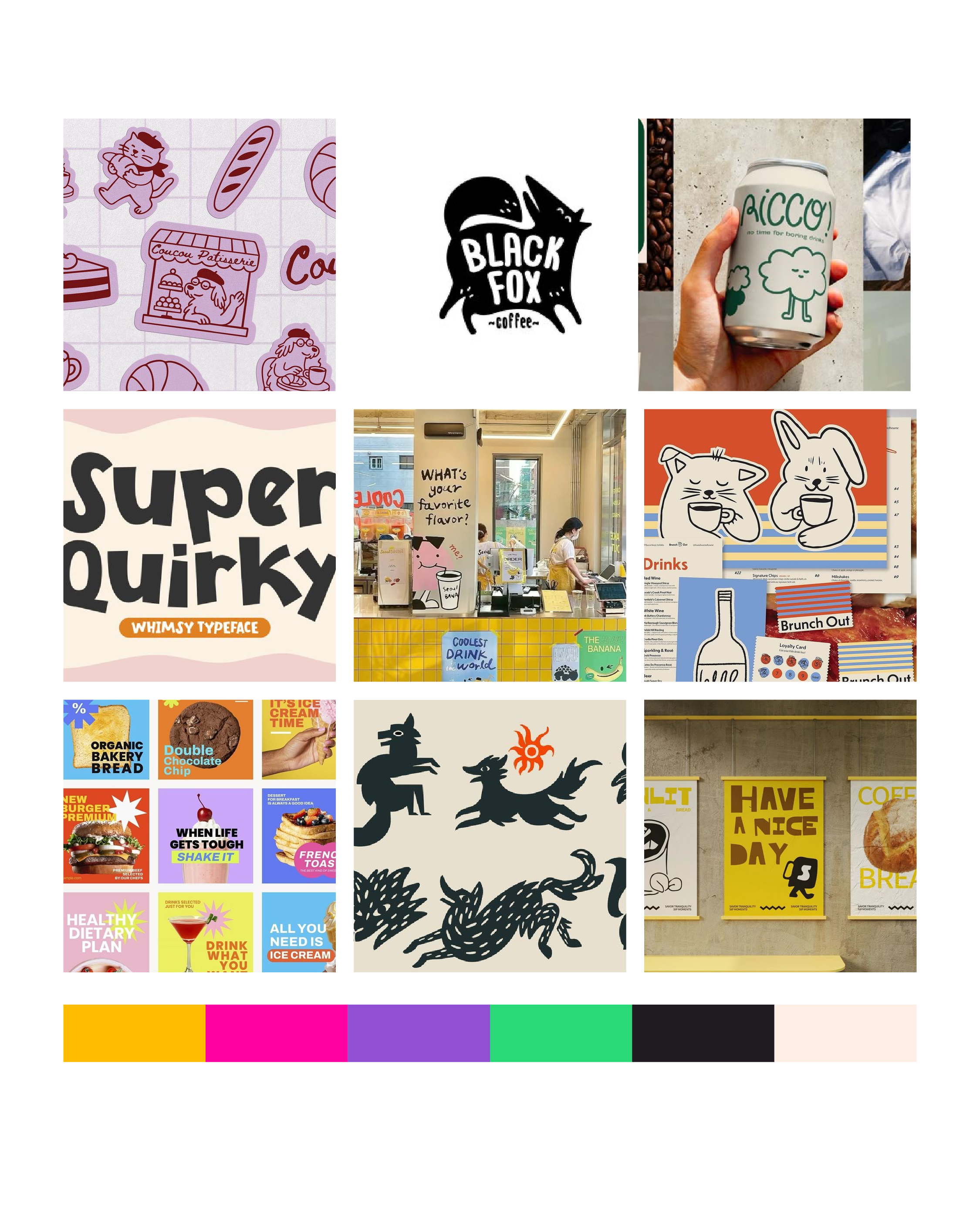
Mood Board Concept
Every project I always create a mood board to help give me the creative direction. The direction I went for in this was still playful, fun, a little quirky with illustrations of the dingo.
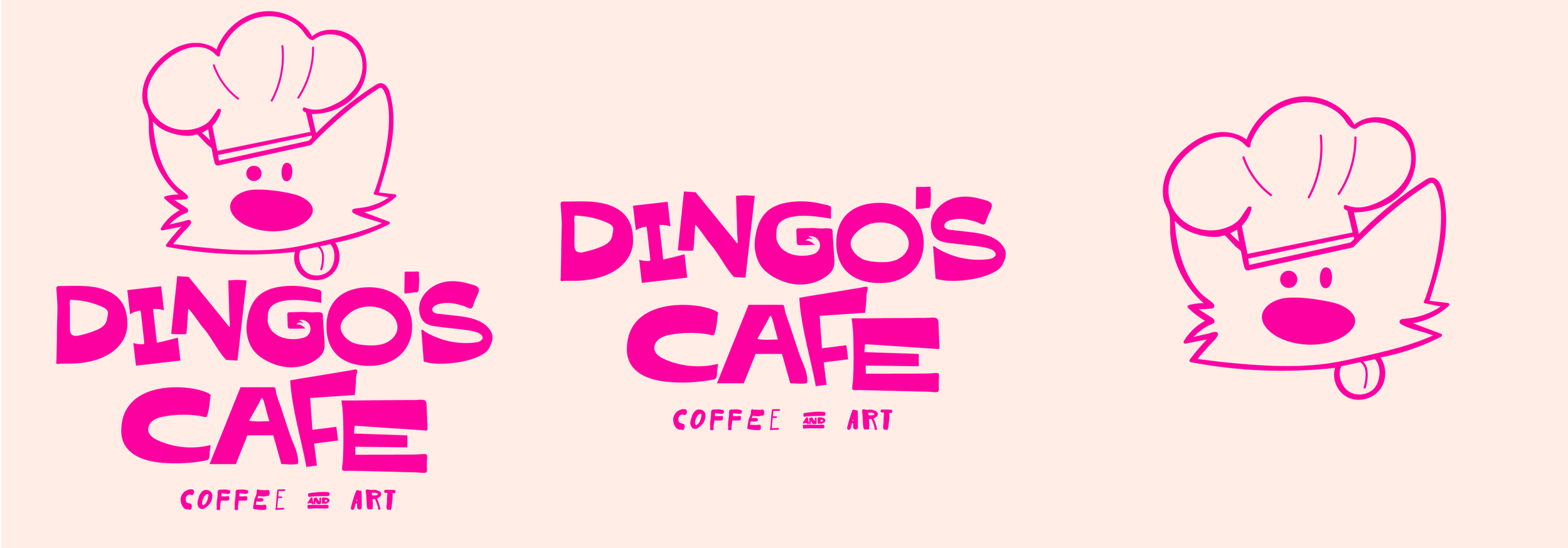
Logo Design
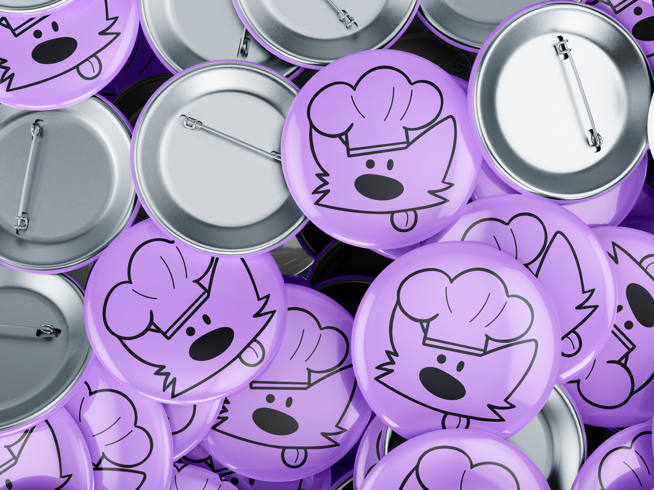
Each letter in the logo was carefully fixed and thoughtfully redesigned to add more distinctive characteristics, enhancing the overall originality. I retained the dingo as the mascot for the design to maintain a sense of fun and uniqueness, creating a memorable and engaging brand identity.

Brand Elements
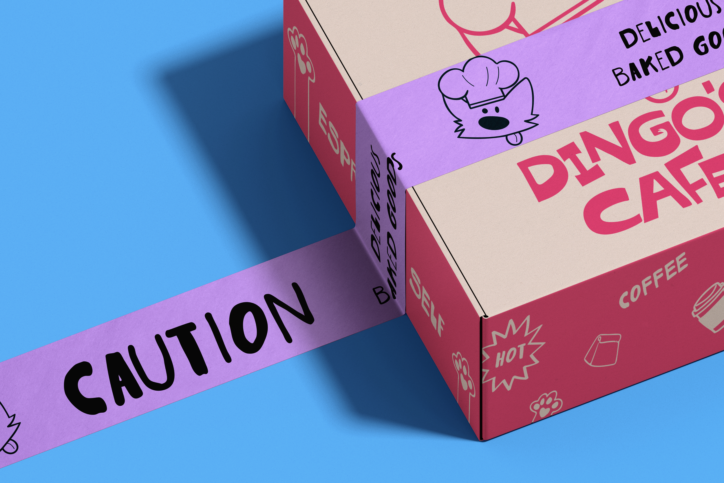
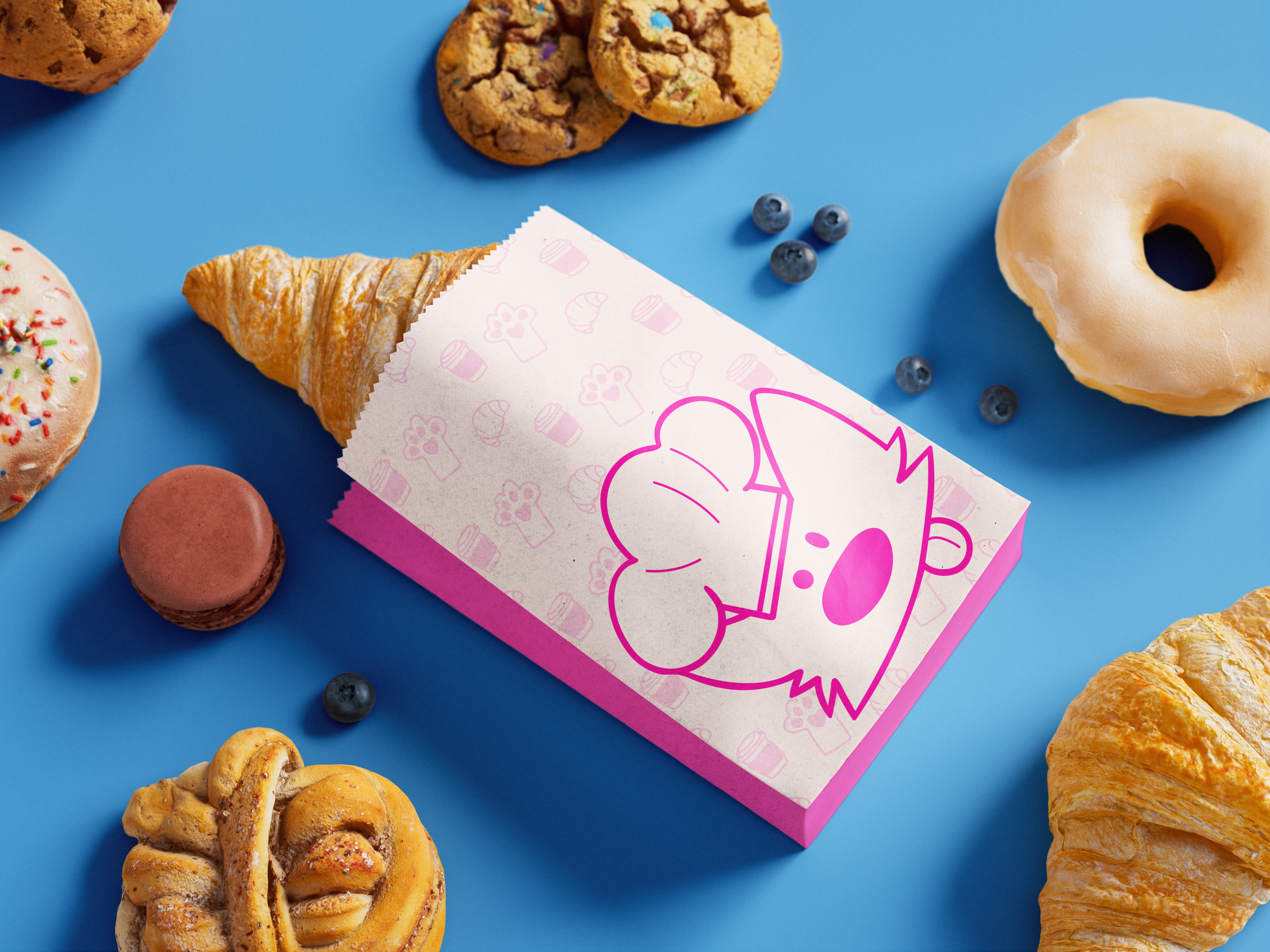
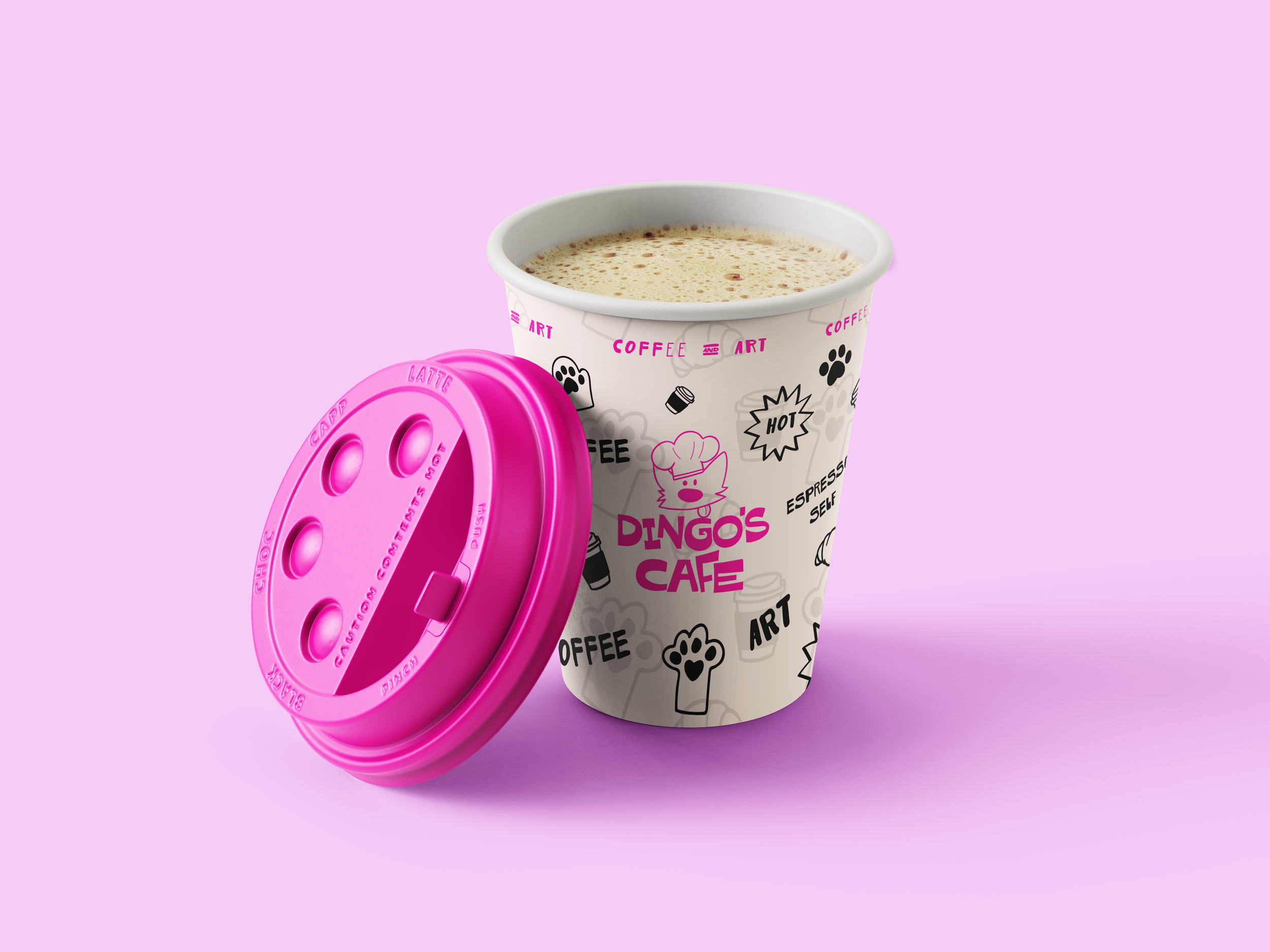
I incorporated doodle-like elements into the brand design to maintain the overall sense of playfulness and artistic expression. These small, hand-drawn details help convey a lively and creative vibe, enhancing the visual identity while keeping it approachable and fun.